[Compose] 컴포즈 공부하기 11 - TopAppBar
TopAppBar는 현재 화면과 관련된 정보와 작업이 표시되는 것이며,
제목, 탐색 아이콘 및 작업에 대한 슬롯(Slot API)이 있다.

@Composable
fun TopAppBar(
    title: @Composable () -> Unit,
    modifier: Modifier = Modifier,
    navigationIcon: @Composable (() -> Unit)? = null,
    actions: @Composable RowScope.() -> Unit = {},
    backgroundColor: Color = MaterialTheme.colors.primarySurface,
    contentColor: Color = contentColorFor(backgroundColor),
    elevation: Dp = AppBarDefaults.TopAppBarElevation
)
TopAppBar의 코드는 위와 같다.
하나하나 알아가보자!
1. title
TopAppBar(
    title = {
        Text("타이틀 입니다!")
    }
)
material 규칙에 따라 만들어져 있는 코드에 따라 나오게 된다.
TopAppBar는 당연히 AppBar로 구현하고 위치는 코드에 따라 수정하게 되는데 title에 간섭하는 부분은 아래와 같다.
navigationIcon이 있을 경우와 없을 경우에 따라 Spacer나 값이 들어가게 되고 기본 typography.h6로 크기가 지정된다.
아래 코드를 참고해보면 좋을 것 같다!
AppBar(
    backgroundColor,
    contentColor,
    elevation,
    AppBarDefaults.ContentPadding,
    RectangleShape,
    modifier
) {
    if (navigationIcon == null) {
        Spacer(TitleInsetWithoutIcon)
    } else {
        Row(TitleIconModifier, verticalAlignment = Alignment.CenterVertically) {
            CompositionLocalProvider(
                LocalContentAlpha provides ContentAlpha.high,
                content = navigationIcon
            )
        }
    }

    Row(
        Modifier.fillMaxHeight().weight(1f),
        verticalAlignment = Alignment.CenterVertically
    ) {
        ProvideTextStyle(value = MaterialTheme.typography.h6) {
            CompositionLocalProvider(
                LocalContentAlpha provides ContentAlpha.high,
                content = title
            )
        }
    }
    //...
}
2. navigationIcon
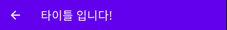
navigationIcon은 start,left에 위치하는 Icon 이다.
TopAppBar(
    title = {
        Text("타이틀 입니다!")
    },
    navigationIcon = {
        IconButton(onClick = { }) {
            Icon(
                imageVector = Icons.Filled.ArrowBack,
                contentDescription = "뒤로가기"
            )
        }
    }
)
3. actions
actions는 end, right 부분에 나오는 IconButton들 이라고 할 수 있으며 RowScope를 가지고 있어서 가로 방향으로 나오게 된다.
TopAppBar(
    title = {
        Text("타이틀 입니다!")
    },
    navigationIcon = {
        IconButton(onClick = { }) {
            Icon(
                imageVector = Icons.Filled.ArrowBack,
                contentDescription = "뒤로가기"
            )
        }
    },
    actions = {
        IconButton(onClick = {}) {
            Icon(
                imageVector = Icons.Filled.Search,
                contentDescription = "검색"
            )
        }
        IconButton(onClick = {}) {
            Icon(
                imageVector = Icons.Filled.Settings,
                contentDescription = "설정"
            )
        }
    }
)
약간 alpha 값이 들어가 있는 걸 볼 수 있는데 아래의 코드처럼 기본적으로 alpha값이 들어 있기 때문이다.
CompositionLocalProvider(LocalContentAlpha provides ContentAlpha.medium) {
    Row(
        Modifier.fillMaxHeight(),
        horizontalArrangement = Arrangement.End,
        verticalAlignment = Alignment.CenterVertically,
        content = actions
    )
}
4. backgroundColor, contentColor, elevation
이름과 코드만으로도 쉽게 이해할 수 있을 것이라고 생각된다!
아래 코드를 참고!
TopAppBar(
    title = {
        Text("타이틀 입니다!")
    },
    navigationIcon = {
        IconButton(onClick = { }) {
            Icon(
                imageVector = Icons.Filled.ArrowBack,
                contentDescription = "뒤로가기"
            )
        }
    },
    actions = {
        IconButton(onClick = {}) {
            Icon(
                imageVector = Icons.Filled.Search,
                contentDescription = "검색"
            )
        }
        IconButton(onClick = {}) {
            Icon(
                imageVector = Icons.Filled.Settings,
                contentDescription = "설정"
            )
        }
    },
    backgroundColor = Color.Red,
    contentColor = Color.Yellow,
    elevation = 10.dp
)
Text(text = "안녕하세요!", modifier = Modifier.height(60.dp))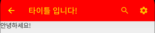
+ elevation은 값을 줘도 제대로 나오지가 않는다. 왜????
같은 현상을 겪는 사람들은 보이는데 명확한 이유는 아직 알아내지는 못했다😥
나중에 알게 되면 추가해두겠다!
[TopAppBar 전체 코드]
@Composable
fun TopAppBar(
    title: @Composable () -> Unit,
    modifier: Modifier = Modifier,
    navigationIcon: @Composable (() -> Unit)? = null,
    actions: @Composable RowScope.() -> Unit = {},
    backgroundColor: Color = MaterialTheme.colors.primarySurface,
    contentColor: Color = contentColorFor(backgroundColor),
    elevation: Dp = AppBarDefaults.TopAppBarElevation
) {
    AppBar(
        backgroundColor,
        contentColor,
        elevation,
        AppBarDefaults.ContentPadding,
        RectangleShape,
        modifier
    ) {
        if (navigationIcon == null) {
            Spacer(TitleInsetWithoutIcon)
        } else {
            Row(TitleIconModifier, verticalAlignment = Alignment.CenterVertically) {
                CompositionLocalProvider(
                    LocalContentAlpha provides ContentAlpha.high,
                    content = navigationIcon
                )
            }
        }

        Row(
            Modifier.fillMaxHeight().weight(1f),
            verticalAlignment = Alignment.CenterVertically
        ) {
            ProvideTextStyle(value = MaterialTheme.typography.h6) {
                CompositionLocalProvider(
                    LocalContentAlpha provides ContentAlpha.high,
                    content = title
                )
            }
        }

        CompositionLocalProvider(LocalContentAlpha provides ContentAlpha.medium) {
            Row(
                Modifier.fillMaxHeight(),
                horizontalArrangement = Arrangement.End,
                verticalAlignment = Alignment.CenterVertically,
                content = actions
            )
        }
    }
}
[참고 및 출처]
https://developer.android.com/jetpack/compose/layouts/basics?hl=ko
Compose 레이아웃 기본사항 | Jetpack Compose | Android Developers
Compose 레이아웃 기본사항 컬렉션을 사용해 정리하기 내 환경설정을 기준으로 콘텐츠를 저장하고 분류하세요. Jetpack Compose를 사용하면 앱의 UI를 훨씬 쉽게 디자인하고 빌드할 수 있습니다. Compose
developer.android.com