Scaffold란?
다양한 구성요소와 기타 화면 요소를 위한 슬롯을 제공하는 것으로 Material Design에 따라 빠르게 조립할 수 있도록 제공하는 것이다.
TopBar, BottomBar, FloatingActionButton, Snackbar 등을 매개변수로 사용할 수 있다.
@Composable
fun Scaffold(
    modifier: Modifier = Modifier,
    scaffoldState: ScaffoldState = rememberScaffoldState(),
    topBar: @Composable () -> Unit = {},
    bottomBar: @Composable () -> Unit = {},
    snackbarHost: @Composable (SnackbarHostState) -> Unit = { SnackbarHost(it) },
    floatingActionButton: @Composable () -> Unit = {},
    floatingActionButtonPosition: FabPosition = FabPosition.End,
    isFloatingActionButtonDocked: Boolean = false,
    drawerContent: @Composable (ColumnScope.() -> Unit)? = null,
    drawerGesturesEnabled: Boolean = true,
    drawerShape: Shape = MaterialTheme.shapes.large,
    drawerElevation: Dp = DrawerDefaults.Elevation,
    drawerBackgroundColor: Color = MaterialTheme.colors.surface,
    drawerContentColor: Color = contentColorFor(drawerBackgroundColor),
    drawerScrimColor: Color = DrawerDefaults.scrimColor,
    backgroundColor: Color = MaterialTheme.colors.background,
    contentColor: Color = contentColorFor(backgroundColor),
    content: @Composable (PaddingValues) -> Unit
)
실제 Scaffold 코드를 보면 이렇게 많은 매개변수가 존재한다! 😅
이번엔 Scaffold에 대해 알아보는 것이기 때문에 자세한 부분 나중에 다시 알아보고,
이번엔 간단하게 하나씩 알아가보자.
우선 Modifier는 넘어가고, scaffoldState, topbar, bottomBar, floatingActionButton, drawer 순으로 설명을 하겠습니다!
1. ScaffoldState
단어 그대로 Scaffold 위젯의 상태를 말한다.
drawer 동작에 대한 수동 제어 및 구성 요소의 크기 등 , SnackbarHostState를 포함한다.
@Stable
class ScaffoldState(
    val drawerState: DrawerState,
    val snackbarHostState: SnackbarHostState
)
Scaffold의 코드를 보면 기본적으로 rememberScaffoldState가 있기 때문에 필요할 때 재지정하여 사용하면 된다.
 val cScope = rememberCoroutineScope()

val scaffoldState = rememberScaffoldState()
Scaffold(scaffoldState=scaffoldState) {
	Button(onClick = {
            ...
            cScope.launch {
                val snackBar =
                scaffoldState.snackbarHostState.showSnackbar("안녕하세요!")
			...
            }
        }){
            ...
        }
}
2. topBar, bottomBar
topBar: @Composable () -> Unit = {},
bottomBar: @Composable () -> Unit = {},
이름 그대로 topBar는 TopAppBar, bottomBar는 BottomAppBar로 생각해주면 된다.
Scaffold(
    topBar = {
        TopAppBar(
            navigationIcon = {
                IconButton(onClick = { /*TODO*/ }) {
                    Image(
                        imageVector = Icons.Filled.ArrowBack,
                        contentDescription = "뒤로 가기",
                        colorFilter = ColorFilter.tint(color = Color.White)
                    )
                }
            },
            title = {
                Text(text = "타이틀")
            },
            actions = {
                IconButton(onClick = {}) {
                    Icon(
                        imageVector = Icons.Outlined.AccountCircle,
                        contentDescription = "계정",
                        tint = Color.White
                    )
                }
            }
        )

    },
    bottomBar = {
        BottomAppBar {
            Button(onClick = { }, modifier = Modifier.weight(1f)) {
                Text("메뉴1")
            }
            Button(onClick = { }, modifier = Modifier.weight(1f)) {
                Text("메뉴2")
            }
            Button(onClick = { }, modifier = Modifier.weight(1f)) {
                Text("메뉴3")
            }
        }
    }
) {

}

왼쪽은 위의 코드를 돌렸을 때고 , 오른쪽은 bottomBar를 BottomAppBar 대신 Row로 했을 때 사진이다.
BottomAppBar와 상관없이 위치가 고정되는 것을 알 수 있다!
bottomBar = {
    Row {
        Button(onClick = { }, modifier = Modifier.weight(1f)) {
            Text("메뉴1")
        }
        Button(onClick = { }, modifier = Modifier.weight(1f)) {
            Text("메뉴2")
        }
        Button(onClick = { }, modifier = Modifier.weight(1f)) {
            Text("메뉴3")
        }
    }
}
3. FloatingActionButton
floatingActionButton: @Composable () -> Unit = {},
floatingActionButtonPosition: FabPosition = FabPosition.End,
isFloatingActionButtonDocked: Boolean = false,
FloatingActionButton에 관한 매개변수는 이렇게 3가지가 있다.
3-1 floatingActionButtonPosition
floatingActionButtonPosition은 FabPosition을 받고 있다.
@Suppress("INLINE_CLASS_DEPRECATED", "EXPERIMENTAL_FEATURE_WARNING")
inline class FabPosition internal constructor(@Suppress("unused") private val value: Int) {
    companion object {
        /**
         * Position FAB at the bottom of the screen in the center, above the [BottomAppBar] (if it
         * exists)
         */
        val Center = FabPosition(0)

        /**
         * Position FAB at the bottom of the screen at the end, above the [BottomAppBar] (if it
         * exists)
         */
        val End = FabPosition(1)
    }

    override fun toString(): String {
        return when (this) {
            Center -> "FabPosition.Center"
            else -> "FabPosition.End"
        }
    }
}
FabPosition 에는 Center와 End만 있다.
2번의 topBar, bottomBar 코드에 추가해서 작성해보면 이렇다.
floatingActionButton = {
    FloatingActionButton(onClick = { }) {
        Icon(
            imageVector = Icons.Filled.Add,
            contentDescription = "더하기",
            tint = Color.White
        )
    }
},
floatingActionButtonPosition = FabPosition.Center,
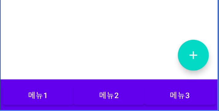
3-2 isFloatingActionButtonDocked
floating ActionButton이 bottomBar와 절반 높이로 겹쳐야 하는지 여부(bottomBar가 존재하는 경우) 라고 설명이 되어있다.
맨 위의 scaffold 를 보면 이 값은 기본값이 false이다.
true로 바꾸게 되면 아래와 같이 나온다.

[floatingActionButton 관련 전체 코드]
floatingActionButton = {
    FloatingActionButton(onClick = { }) {
        Icon(
            imageVector = Icons.Filled.Add,
            contentDescription = "더하기",
            tint = Color.White
        )
    }
},
floatingActionButtonPosition = FabPosition.End,
isFloatingActionButtonDocked = true,
4. Drawer
drawerContent: @Composable (ColumnScope.() -> Unit)? = null,
drawerGesturesEnabled: Boolean = true,
drawerShape: Shape = MaterialTheme.shapes.large,
drawerElevation: Dp = DrawerDefaults.Elevation,
drawerBackgroundColor: Color = MaterialTheme.colors.surface,
drawerContentColor: Color = contentColorFor(drawerBackgroundColor),
drawerScrimColor: Color = DrawerDefaults.scrimColor,
4-1 drawerContent, drawerGesturesEnabled
drawerContent는 ColumScope로 되어있고 메뉴에 넣을 내용을 넣어주면 되고,
drawerGesturesEnabled는 제스처를 사용할지의 여부이다.
  val scaffoldState = rememberScaffoldState()
  val scope = rememberCoroutineScope()

 Scaffold(
        scaffoldState = scaffoldState,
        topBar = {
            TopAppBar(
                navigationIcon = {
                    IconButton(onClick = {
                        scope.launch {
                            scaffoldState.drawerState.open()
                        }
                    }) {
                     Image(
                            imageVector = Icons.Filled.Menu,
                            contentDescription = "메뉴",
                            colorFilter = ColorFilter.tint(color = Color.White)
                        )
                    }
                },
              ....
            )

        },

        ....

        drawerContent = {
            Text(text = "drawer 1")
            Text(text = "drawer 2")
            Text(text = "drawer 3")
            Text(text = "drawer 4")
        },
        drawerGesturesEnabled = scaffoldState.drawerState.isOpen

    )
scaffoldState를 가져와 지정해주고 navigationIcon을 menu로 변경해 클릭시 drawer를 open 하도록 하였다.
drawerGesturesEnabled는 drawer가 open인 상태일때만 사용하도록 해주었다.
위 코드는 아래와 같이 동작한다!
4-2 drawerShape
drawer sheet의 shape을 의미하며 custom으로 Shape을 만들어 지정해 줄 수 있다.
custom은 여기에서 코드를 가져와서 작성 해주었다.
drawerShape = customDrawerShape(500f)

fun customDrawerShape(height: Float) = object : Shape {
    override fun createOutline(
        size: Size,
        layoutDirection: LayoutDirection,
        density: Density
    ): Outline {
        return Outline.Rounded(
            RoundRect(
                left = 0f,
                top = 0f,
                right = height,
                bottom = 1800f,
                //You can also add bottomRightCornerRadius
                topRightCornerRadius = CornerRadius(x = 90f, y = 90f)
            )
        )
    }
}


4-3 drawerBackgroundColor, drawerContentColor, drawerScrimColor, drawerElevation

drawerElevation = 30.dp,
drawerBackgroundColor = Color.Blue,
drawerContentColor = Color.Red,
drawerScrimColor = Color.Yellow
이름 그대로 drawerBackgroundColor는 drawer sheet의 background 색,
drawerContentColor는 content의 색,
drawerScrimColor는 drawer가 열릴 때 뒤의 배경색이다!
drawerElevation은 말 그대로 elevation이고 dp 단위로 쓰면 된다.
content와 contentColor는 이름 그대로이기 때문에 생략했다!
snackbar는 바로 다음에 올릴 예정이니 그걸 참고해주면 될 것 같다 ㅎㅎ
[전체 코드]
@Composable
fun ScaffoldEx() {
    val scaffoldState = rememberScaffoldState()
    val scope = rememberCoroutineScope()

    Scaffold(
        scaffoldState = scaffoldState,
        topBar = {
            TopAppBar(
                navigationIcon = {
                    IconButton(onClick = {
                        scope.launch {
                            scaffoldState.drawerState.open()
                        }
                    }) {
                        Image(
                            imageVector = Icons.Filled.Menu,
                            contentDescription = "메뉴",
                            colorFilter = ColorFilter.tint(color = Color.White)
                        )
                    }
                },
                title = {
                    Text(text = "타이틀")
                },
                actions = {
                    IconButton(onClick = {}) {
                        Icon(
                            imageVector = Icons.Outlined.AccountCircle,
                            contentDescription = "계정",
                            tint = Color.White
                        )
                    }
                }
            )

        },
        bottomBar = {
            BottomAppBar {
                Button(onClick = { }, modifier = Modifier.weight(1f)) {
                    Text("메뉴1")
                }
                Button(onClick = { }, modifier = Modifier.weight(1f)) {
                    Text("메뉴2")
                }
                Button(onClick = { }, modifier = Modifier.weight(1f)) {
                    Text("메뉴3")
                }
            }
        },

        floatingActionButton = {
            FloatingActionButton(onClick = { }) {
                Icon(
                    imageVector = Icons.Filled.Add,
                    contentDescription = "더하기",
                    tint = Color.White
                )
            }
        },
        floatingActionButtonPosition = FabPosition.End,
        isFloatingActionButtonDocked = true,

        drawerContent = {
            Text(text = "drawer 1")
            Text(text = "drawer 2")
            Text(text = "drawer 3")
            Text(text = "drawer 4")
        },
        drawerGesturesEnabled = scaffoldState.drawerState.isOpen,
        drawerShape = customDrawerShape(500f),
        drawerElevation = 30.dp,
        drawerBackgroundColor = Color.Blue,
        drawerContentColor = Color.Red,
        drawerScrimColor = Color.Yellow

    ) {

    }
}


fun customDrawerShape(height: Float) = object : Shape {
    override fun createOutline(
        size: Size,
        layoutDirection: LayoutDirection,
        density: Density
    ): Outline {
        return Outline.Rounded(
            RoundRect(
                left = 0f,
                top = 0f,
                right = height,
                bottom = 1800f,
                //You can also add bottomRightCornerRadius
                topRightCornerRadius = CornerRadius(x = 90f, y = 90f)
            )
        )
    }
}
이렇게 scaffold의 다양한 값을 알아보았다 😄
일부를 제외하고 하나하나 설명을 넣다보니 조금 길어졌는데 잘 이해가 되었으면 좋겠다.
참고 및 출처
Material 구성요소 및 레이아웃 | Jetpack Compose | Android Developers
Material 구성요소 및 레이아웃 컬렉션을 사용해 정리하기 내 환경설정을 기준으로 콘텐츠를 저장하고 분류하세요. Jetpack Compose는 디지털 인터페이스를 만들기 위한 포괄적인 디자인 시스템인 Mate
developer.android.com
Scaffold | Jetpack Compose | Android Developers
In Material Design, a scaffold is a fundamental structure that provides a standardized platform for complex user interfaces. It holds together different parts of the UI, such as app bars and floating action buttons, giving apps a coherent look and feel. Ex
developer.android.com
Navigation Drawer in Jetpack Compose: A Complete Guide
We are going to use the Jetpack Navigation component for Compose and create a Drawer with multiple destinations. I will be directly creating the composables and explaining all the important things line by line in the comments.
www.linkedin.com
'개발 공부 > 안드로이드' 카테고리의 다른 글
| [Compose] 컴포즈 공부하기 8 - CheckBox (0) | 2023.09.13 |
|---|---|
| [Compose] 컴포즈 공부하기 7 - Snackbar (0) | 2023.09.11 |
| [Compose] 컴포즈 공부하기5 - ConstraintLayout 2 (0) | 2023.09.06 |
| [Compose] 컴포즈 공부하기5 - ConstraintLayout 1 (0) | 2023.09.06 |
| [Compose] 컴포즈 공부하기4 - Image (with painter) (0) | 2023.08.30 |